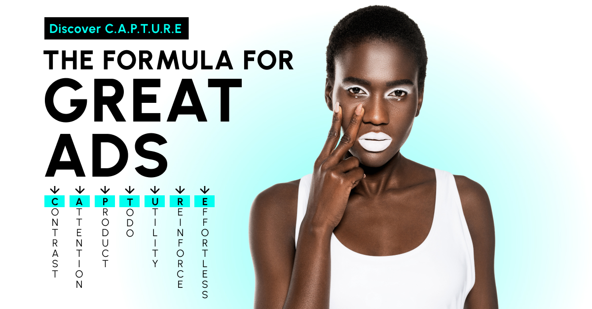
The C.A.P.T.U.R.E. Formula for Great Ads
- Contrast
- Attention, please!
- Product
- To Do
- Utility
- Reinforce branding
- Effortless user-flow
Today we will be learning a practical formula you could use to analyze the ads you are seeing every day, in a smart way and build your own, at the same time.
By the end of this article, you will learn:
- 7 critical points that are highly important in any type of static AD (non-video), when it comes to performance (Please keep in mind that this is from a creation standpoint – reason why the landing pages of the below campaigns are not part of the formula in this analysis);
- How to spot GREAT ADS & POOR ADS in an ocean of content;
- How advertisers use COPY & GRAPHICS to capture your attention;
The C.A.P.T.U.R.E.
Formula for Great Ads
#1 CONTRAST – Capture your audience’s eyes’ by using color combinations that create contrast. In a world where people scroll fast through content, contrast is the first thing to capture attention and stop them in the feed. Contrast doesn’t just act like a magnet, but can ease the reading process when contrast is used for text used on the ad too. Always remember your ad in seen in context and not standing alone, this is why visual CONTRAST is so important. 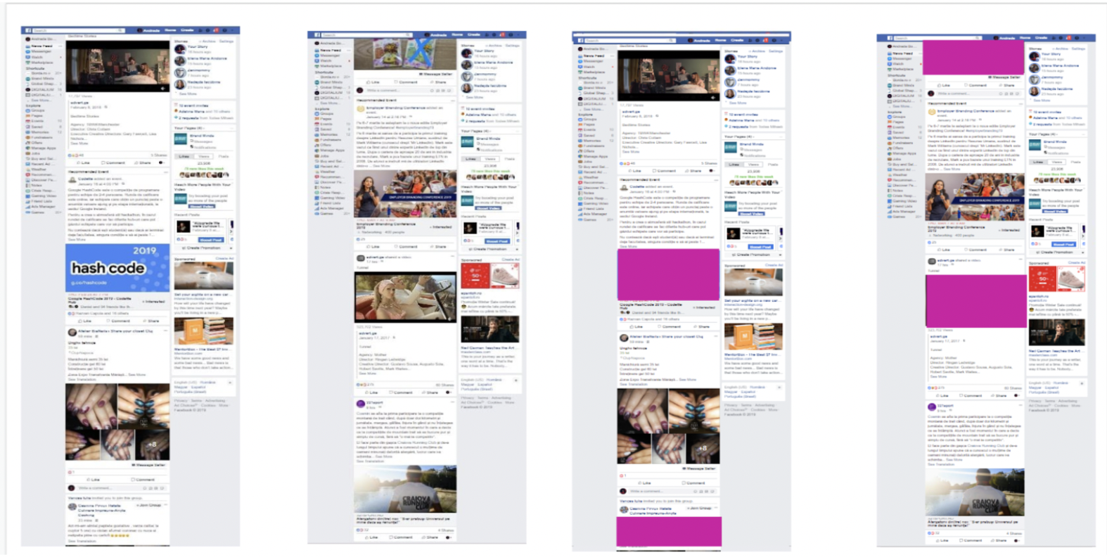
*Great AD example for CONTRAST:


#2 ATTENTION, please! Grab people’s Attention with a bold HEADLINE. Use a captivating headline that tells people exactly what they’ll get if they continue reading. Always think of the HEADLINE as if people will not read the rest of the copy. The HEADLINE is the biggest text on your ad.
#3 PRODUCT – Your AD should be a visual translation of the product you sell. Whether it is a product, a service, or an experience that you are selling, it has to be properly presented from a visual perspective in your graphic creation. Don’t make people guess what your AD is about. You have a second of their time, and a feed scroll to have your message getting their attention and your product seen. The attention & time people invest into content consumption is very limited. Advertising should be as easy to understand as possible if you want it to be efficient.
#4 TO DO: You got my attention – you stopped me in the feed with an AD that has great color contrast, a clear headline, and a product that I am interested in. Now what is it that you want me to do? Don’t make me think too much, just tell them straightforwardly what should I do: Our brains are wired to save as much energy as possible. Any text/copy that requires an effort to be decoded, understood, or translated, will have fewer chances of being consumed and processed.
#5 UTILITY: If the first 3 steps haven’t yet convinced me to take further action (buy/ visit/ book/ click), the next phase is to tell me how is this useful to me. Present me the best features of your product/service/ experience and make me understand what is their utility for me. This is where you sell your product/service IF you have succeeded in capturing your audience’s interest through the headline. Important to keep in mind: A brand’s voice or slang should also be properly infused into an AD’s message. Especially if it speaks to loyal customers, a well-used tone will immediately make the avid readers recognize their favorite brand and turn their attention toward learning more.
#6 REINFORCE BRANDING: Brand your ad properly. Branding is the longest form of marketing investment. Make sure you properly use all of your brand colors, fonts & symbols in all your content.
#7 EFFORTLESS USER FLOW: The last point in the formula is not necessarily related to the creative strategy, but to the sale process which, in the end, is the end goal of your AD. What happens after the user clicks on your ad? Is the landing page ready to sell? Will they find on your product page exactly what they were promised? Is it easy to check out and finish the purchase/ booking? Or do they have to make extra efforts to get to what you sold them?
TIME TO PRACTICE
Let’s use the C.A.P.T.U.R.E. Formula to analyze 3 ADS that were displayed in my web feed.
To help you understand better how color contrast works, I am going to screenshot some of the web page context as well.
#1 ORANGE AD – MOBILE COMPANY
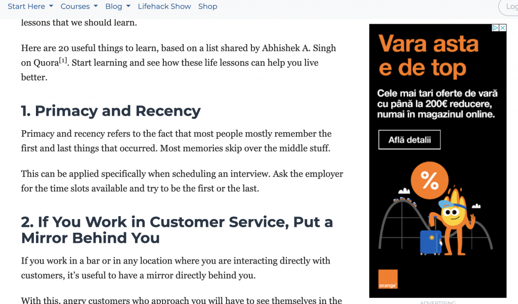
#1 CONTRAST – Good. You can easily read the text. You can easily spot the ad on the web page: A plain black background with white & light orange text makes it quite visible in the web page context.
#2 ATTENTION GRABBER – THE HEADLINE: This summer is on Top! The headline can use a better copy. It doesn’t tell you what the ad is about. A great headline would highlight either a need, a pain point, or a desired mood/experience: something that people wish to achieve, obtain, avoid, or understand. Always think of your ads as if they are seen for the very first time by your target audience. Think that people don’t know your brand, they don’t know what you’re selling, they don’t know what’s in it for them, and you have to tell them and be as clear as possible about it.
#3 PRODUCT – A coaster, luggage, and a percentage sign. We can assume the Top in the headline is related to the coaster but the visual is still missing the product. What is this actually about? Offers for what? For coasters? For luggaes? For vacations? It makes you guess. The campaign is missing the core highlight: the product/ SMARTPHONE.
#4 TO DO – Afla detalii / Learn More. The CTA would be more efficient if the customer would know what to learn more about.
#5 UTILITY – The best summer offers, up to 200 EUR discount, only in the online store. 200 EUR discount for what? How are they helping me, as a customer? People are skimmers, if we don’t tell them straightforwardly what’s in it for them, we lose them.
#6 REINFORCE BRANDING –The brand is clean and present in the ad (logo, fonts, colors) no side notes regarding this.
#7 EFFORTLESS USER FLOW: The user flow requires a more complex analyst which we will not go through at this moment.
#2 FANTA AD – BEVERAGE COMPANY
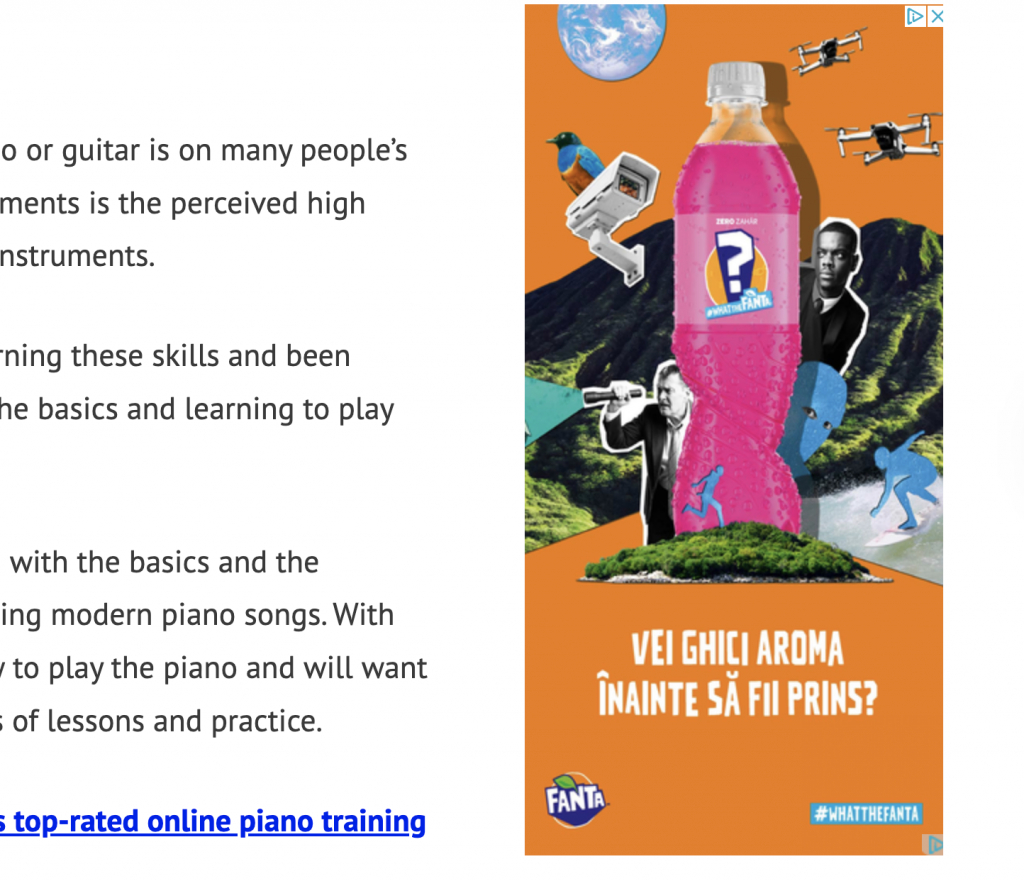
#1 CONTRAST – Good. You can easily read the text. You can easily spot the ad on the web page: Plain ORANGE background with white text makes it quite visible in the web page context.
#2 ATTENTION GRABBER – HEADLINE – Will you guess the flavor before getting caught? For someone who is seeing this ad for the first time, the specificity of the copy could use some improvements. It’s not a remarketing AD (I am seeing it for the first time) and the message can be considered to be too abstract and unclear regarding what the campaign is about. If it’s a teasing question to challenge the curiosity: Will you guess the flavor before getting caught? I would ask: Why am I getting caught with? Why do I have to guess a flavor? And most important – what’s in it for me as a customer to keep on spending my time learning more about something that I don’t have enough information about?
#3 PRODUCT – VISUAL – The visual is highlighting the product, the soda bottle surrounded by drones, and security cameras, people looking for something. It is a great translation of the message if the message would have been clearer regarding what’s in it for the customer if they get into the game.
#4 TO DO – No CTA Button.
#5 UTILITY: No further description here. Just a hashtag #WhatTheFanta – It would be great if the incentive/ prize would have been clear.
#6 REINFORCE BRANDING: The brand is clean and present in the ad (logo, fonts, colors) no further notes regarding this.
#7 EFFORTLESS USER FLOW: The user flow requires a more complex analyst which we will not go through at this moment.
#3 SEM RUSH AD – ADVERTISING COMPANY
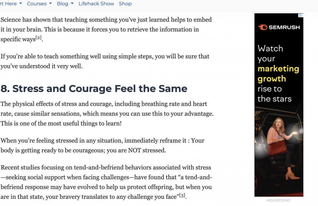
#1 CONTRAST – Good. You can easily read the text. You can easily spot the ad on the web page: a plain BLACK background with white & light yellow text that makes it quite visible in the web page context.
#2 ATTENTION GRABBER – HEADLINE – Watch your marketing growth rise to the stars. It’s all clear and incentivizing enough: If I am looking to improve my marketing campaigns this ad will guide me to the next steps. Great targeting, great messaging.
#3 PRODUCT – VISUAL – We might say the ad (rise to the stars) is a metaphor considering the visual translated into an image of a potential celebrity getting out of the car to step on the red carpet, with all the lights surrounding her. However, from a critical standpoint, I would say the visual is too abstract for a marketing platform ad. It would be more appropriate for a fashion brand, an event company, or a movie teasing campaign.
#4 UTILITY: No further description here.
#5 TO DO – Watch your marketing growth rise to the stars. The ad mixes the headline with the Call to Action: What do you have to do? Watch your marketing growth rise. Here, I would rather go for a clear CTA/ to-do. The verb Watch makes me literally what it says:…just watch. It doesn’t lead my actions to Learn more or click or discover the how.
#6 REINFORCE BRANDING: The brand’s logo is present, and so are their core colors (even though SEMRUSH is using purple and light blue more often than light yellow). What would improve the ad in this particular case it would be a brief tagline explaining what SEMRUSH is, for those who did not have a first touch with the platform yet.
#7 EFFORTLESS USER FLOW: The user flow requires a more complex analyst which we will not go through at this moment.
TO SUM IT UP: The order of the 7 elements of the C.A.P.T.U.R.E. formula matters & here’s why:
- CONTRAST: Contrast is the first visual hook that captures your attention, whether that is in a digital feed or in the streets. When your see something which is disruptive to your eyes you stop and check it up. It’s the way our brains work to keep us alive: whatever seems to be unusual to the natural environment we live in gets checked and verified to make sure it’s not a threat.
- ATTENTION GRABBER – Headline: After your eyes stopped captured by an AD chromatic contrast, the next thing that leads your attention is the BIGGEST TEXT on the ad, which is usually the HEADLINE. This is when you decide if the ad speaks to your needs or not. Is the text relatable to you? If yes, you will continue reading the message, if not, you will move your attention forward.
- PRODUCT – VISUAL – If you decide the AD is for you and there might be something of interest there, you will automatically check if the VISUAL reinforces the headline. Does it match what the headline promises?
- TO DO – If the headline & the product sold you to close the purchase, the CTA button is just a natural reinforcer of what you need to do to get to the finish line/checkout.
- UTILITY: This is where you sell your product/service’s best features IF you haven’t succeeded in doing it through the product & headline.
- REINFORCE BRANDING: If you are seeing an AD by a particular company for the first time, the brand elements will help you remember the company’s visual identity the next time you see one of their ADS (IF & ONLY IF the branding was used properly). If this is not the first time you are seen their ADS, branding goes a few steps above from point 6 to point 2 or 3. That is because when it is used well and with a high frequency in impressions it has an important role in capturing your attention: you will immediately recognize a renowned brand by its colors/ fonts/ icons or messages in an ocean of content.
- EFFORTLESS USER FLOW: The last point in the formula kicks at the moment you AD persuaded your target persona to take action and move forward to the next step. It is related to the entire user experience & flow after the person lands on the second level of the conversion funnel: the product landing page.
In conclusion, if you are an advertiser, use the formula wisely, if you are a consumer, now you know what to pay attention to if you want to asses whether an AD is good or not.
In the meantime, stay around, because we’ll have more assessments coming soon!