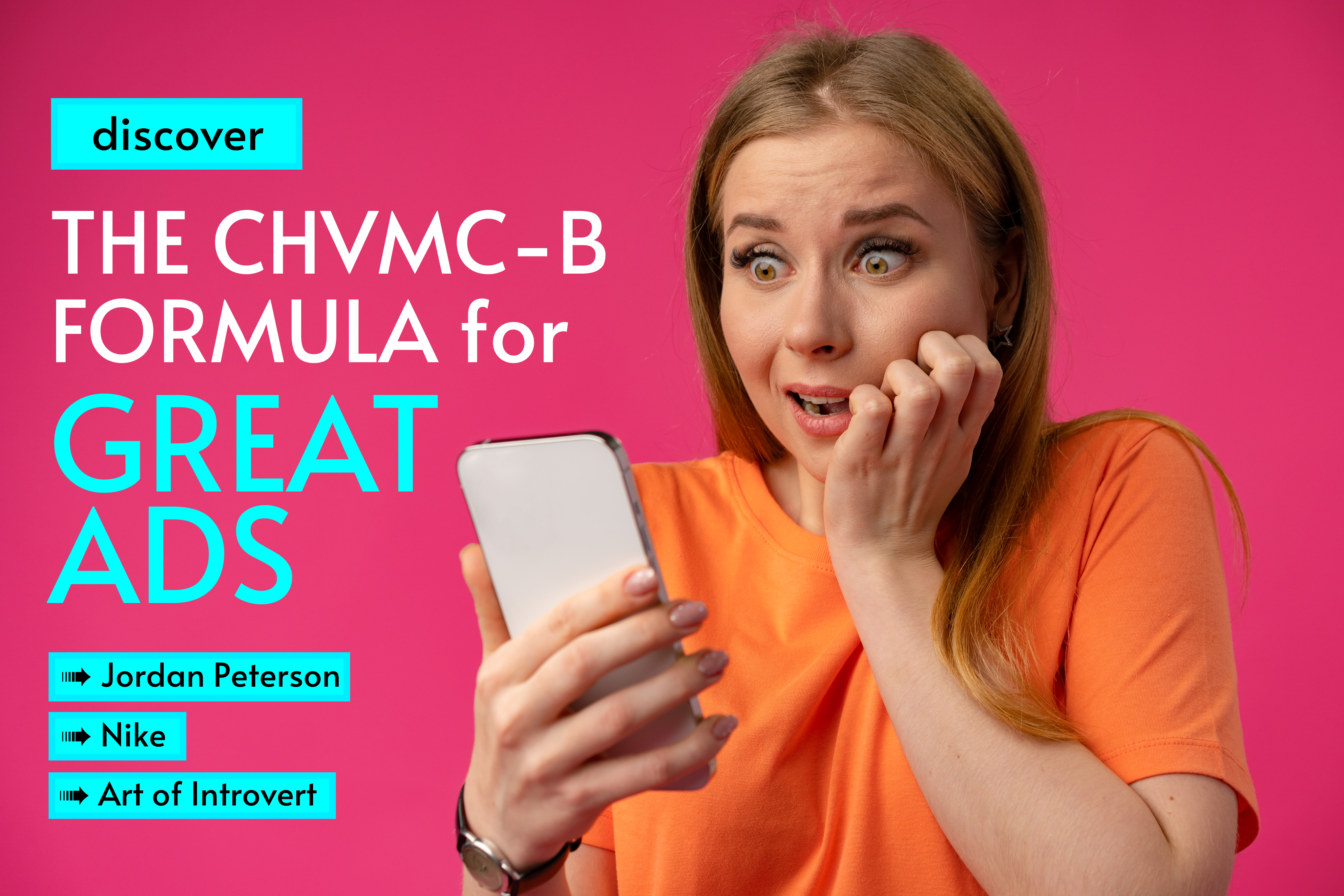
The CHVMC-B Formula for Great Ads #2
ADS: Nike / Jordan Peterson / Art of Introvert
The CHVMC-B formula helps you analyze the ads you are seeing every day, in a smart way!
By the end of this article, we will analyze 3 ADS and you will learn:
- 6 critical points that are highly important in any type of AD, when it comes to performance (Please keep in mind that this is from a creation standpoint – reason why the landing pages of the below campaigns are not part of the formula in this analysis);
- To spot GREAT ADS & POOR ADS in an ocean of content;
- How advertisers are using COPY & GRAPHICS to capture your attention;
The CHVMC-B Formula for Great Ads
- CONTRAST – Capture your audience’s eyes using great color combinations to make the text easy to read and easy to stand out on a web page; Remember your AD is not viewed standing alone on the web, but in a sea of side content;
- HEADLINE – Hook people’s attention; Use a captivating headline that tells people exactly what they’ll get if they continue reading. Always think of the HEADLINE as if people will not read the rest of the copy;
- VISUAL – Visualize your AD after you finished the COPY and translate it as best as you can in a visual way. Your AD should be a visual translation of any of the following: 1) The product/the service; 2) The mood or the experience your product/service is creating/ 3) The person your service/product is targeting.
- MESSAGE (ad description): Make the best features of your product/service matter! Use the description text to highlight the best features. This is where you sell your product/service IF you have succeeded in capturing your audience’s interest through the headline. Important to keep in mind: A brand’s voice or slang should also be properly infused into an AD’s message. Especially if it speaks to loyal customers, a well used tone will immediately make the avid readers recognize their favourite brand and turn their attention toward learning more.
- CTA BUTTON: Call people into taking action! Don’t make them think, tell them straightforwardly what to do: Our brains are wired to save as much energy as possible. Any text/copy that requires an effort to be decoded, understood, or translated, will have fewer chances of being consumed and processed.
- BRAND: Brand your ad properly. Branding is the longest form of marketing investment. First: You raise your product/ service’s chances to be purchased with less marketing investment by multiplying the touchpoints where your brand is placed. Second: The frequency with which your brand is seen and associated with its core features/benefits is the second thing you should consider when it comes to long-term investment iny our brand awareness.
TIME TO PRACTICE
Let’s use The CHVMC-B Formula to analyze the next 3 ADS:
#1 JORDAN PETERSON

- CONTRAST – GREAT. You can easily read the text. You can easily spot the ad on the web page: Plain black background with yellow & white text makes it quite visible in the web page context.
- HEADLINE – The only personality test you’ll ever need. GREAT headline. It tells you exactly what the product is about. Plus, is doing this in a way that is incentivizing and intriguing, making you think WHAT is SO COOL about this test that you won’t have to do another one, ever.
- VISUAL –DEBATABLE. Dr. Jordan Peterson’s picture, from an advertising angle, can be debated in 2 ways: 1) Since he’s both a celebrity and a psychologist, it adds to the promo through his professional expertise and it offers a guarantee that the test will be worth it. However, if we look at it from an angle of non-remarketing AD, targeting people who might not know who Dr. Peterson is, the picture could be misinterpreted as the persona the ad is dedicated to: men, aged 50+. Another positive aspect is the obscure light in which the photo is taken: Peterson is coming out of darkness and it could be interpreted as a reinforcer for the AD message: discovering your personality.
- MESSAGE: GREAT – In this case the message is pretty much the same with the headline, however, if we refer to the other description texts on the AD, they are great and this is for 2 reasons: 1) first text: 600.000 tests completed = social proof. / Understand Myself = it’s about YOU / Dr. Jordan Peterson = Expertise Reinforcer.
- CTA BUTTON: Learn More. GREAT.
- BRAND: The brand is clean and present in the ad (signature /logo), fonts, colors) no side notes regarding this.
#2 NIKE AD
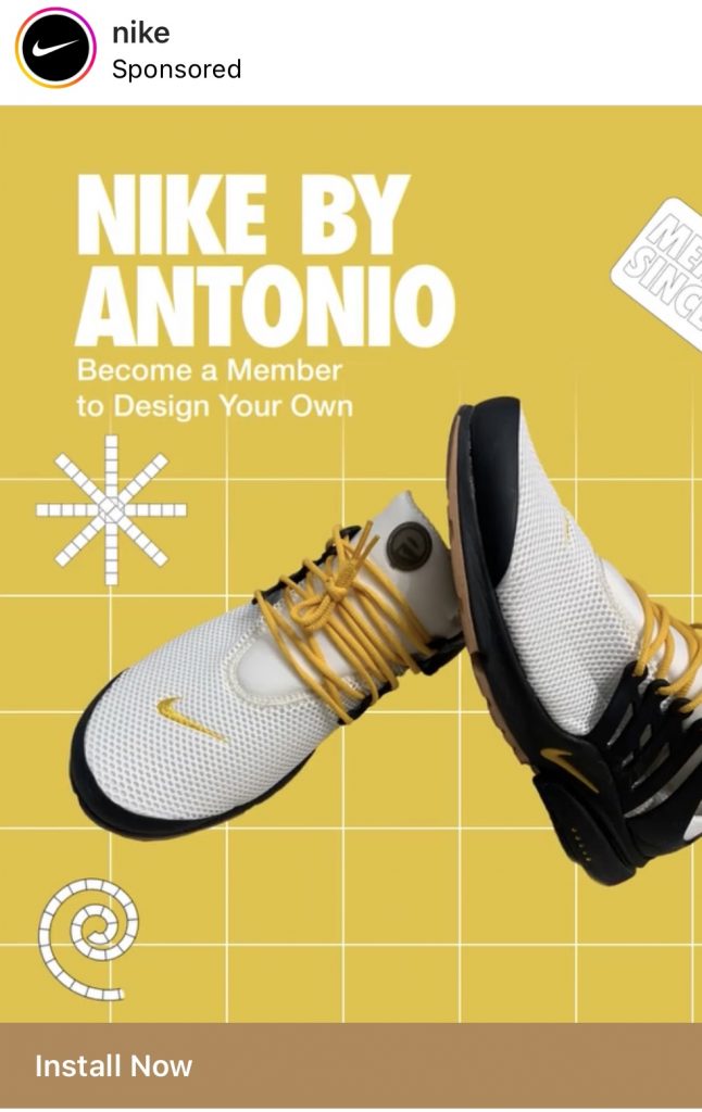
- CONTRAST – DEBATABLE. White text on yellow is not the best choice when you want to make it easier for people to read your text.
- HEADLINE – Nike by Antonio. DEBATABLE. The aim is to communicate the fact that you can design your own shoes, but from a clarity standpoint, the message would have been much clearer if we would read DESIGN YOUR OWN NIKES. This way, I don’t know who is Antonio, why should this be of interest to me? Second, if Nike wouldn’t have been a globally renowned brand and we would replace the company name with a regular one, such as SMITHSON BY ANTONIO, would that still mean something for a person whose attention is demanded by hundreds of ADS daily? Not exactly.
- VISUAL –GREAT. We see the product. I would only question the side elemnts: the swirl effect and the star, which are not part of Nike’s visual identity and doesn’t seem to have a particular meaning in the graphics.
- MESSAGE: DEBATABLE – Become a member to design your own. Become a member where exactly? A clearer message would have been Join the Club to design your own.
- CTA BUTTON: Install Now. GREAT.
- BRAND: The brand is clean and present in the ad (logo/fonts) no side notes regarding this.
#3 ART OF INTROVERT – ONLINE COURSES COMPANY
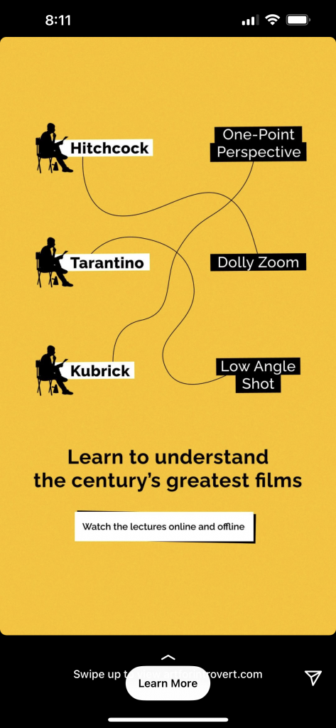
- CONTRAST –GREAT. You can easily read the text. Plain yellow background with black text makes the AD easy to read.
- HEADLINE – Learn to understand the century’s greatest films. GREAT. It’s crystal clear what’s in it for you if you stay here to learn more.
- VISUAL –GREAT. The gamification concept is absolutely brilliant. Famous movie directors are related to the techniques that made them renowned. It’s clear that the ad is targeting a niche audience of people interested in studying cinematography and movie directing to whom the names on the AD will trigger the attention button instantly.
- MESSAGE: GREAT – Watch the lectures online and offline. The text is reinforcing the message that this is a course by mentioning the word lectures, then is describing a side benefit: the platforms allows you to watch the content even while offline.
- CTA BUTTON: Learn More. GREAT.
- BRAND: The brand is clean and present in the ad (logo/fonts) no side notes regarding this.
TO SUM IT UP: The order of the CHVMC-B formula matters
- Contrast: Contrast is the first visual hook that captures your attention, whether that is in a digital feed or in the streets. When your see something which is disruptive to your eyes you stop and check it up. It’s the way our brains work to keep us alive: whatever seems to be unusual to the natural environment we live in gets checked and verified to make sure it’s not a threat.
- Headline: After your eyes stoped captured by an AD chromatic contrast, the next thing that lead your attention is the BIGGEST TEXT on the ad, which is usually the HEADLINE. This is when you decide if the ad speaks to your needs or not. Is the text realatable to you? If yes, you will continue reading the message, if not, you will move your attention forward.
- Visual: If you decided the AD is for you and there might be something of your interest there, you will automatically check if the VISUAL reinforces the headline. Does it matches what the headline’s promises?
- Message: This is where you get converted to take action. If the advertisers got your attention up until this point, this is where you learn more about the product/service. This is where you get persuaded or not by the strenghts and the benefits of the AD’s product/service.
- CTA Button: If the message sold you to close the purchase, the CTA button is literally just a natural reinforcer of what you need to do to get to the finish line/checkout.
- Brand: If you are seeing an AD by a particular company for the first time, the brand elements will help you remember the company’s visual identity next time you see one of their ADS (IF & ONLY IF the branding was used properly). If this is not the first time you are seeing their ADS, branding goes a few steps above from point 6 to point 2 or 3. That is because when it is used well and with a high frequency in impressions it has an important role in capturing your attention: you will immediately recognize a renowned brand by its colours/ fonts/ icons or messages in an ocean of content.
As a conclusion, if you are an advertiser, use the formula wisely, if you are a consumer, now you know at what to pay attention to if you want to asses whether an AD is good or not.
In the meantime, stay around, because we’ll have more assessments coming soon!